


Our six senior AI creative experts strategise, advise and review your work, right on the page. Just like a real team.
You have traffic. Your ads are running, your SEO is climbing, and people are landing on your site. But they aren’t staying. They aren’t buying, signing up, or booking demos. This is the “leaky bucket” problem that plagues digital agencies and product teams alike: you are pouring resources into acquisition, but the vessel—your page—cannot hold the value.
Solving this isn’t just about changing a button color to green or rewriting a headline. Learning how to increase page conversions is a multi-disciplinary challenge that requires tight coordination between design, performance, copy, and user experience (UX). When these elements fragment—when your designer optimizes for beauty but kills page speed, or your copywriter writes clever hooks that confuse the user flow—conversions tank.
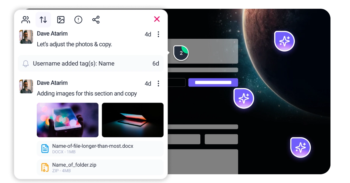
This is where Atarim changes the game. Instead of treating conversion optimization as a series of isolated tasks, Atarim unifies your workflow. It allows you to visually pinpoint issues directly on the live canvas, bringing your entire team—from Pixel ensuring your visuals are trustworthy to Navi smoothing out accessibility friction—onto the same page. It transforms the chaotic feedback loop into a structured path to higher revenue.
Improving conversions isn’t about guessing; it’s about systematic analysis. Before you change a single pixel, you need to audit the specific layers of your page that influence decision-making. You cannot fix what you cannot measure or see.
First impressions are biological, not just aesthetic. Within 50 milliseconds, a visitor decides if your site feels “safe” and professional. You need to analyze your visual hierarchy to ensure it guides the eye naturally. Does the design lead the user to the value proposition, or is it cluttered with competing elements? This is the domain of design precision. You must evaluate if every visual element supports the conversion goal rather than distracting from it. If a user has to “hunt” for the next step, you have already lost them.
A pretty page that is impossible to navigate is worthless. You must evaluate the “path of least resistance.” Are your forms asking for too much information too soon? Is the mobile experience frustrating for users with larger fingers or assistive technology? Ignoring accessibility doesn’t just invite lawsuits; it alienates nearly 20% of the global population who control significant spending power. An accessible site is a usable site, and usability is the foundation of conversion.
position: sticky; bottom: 0;) so it is always accessible, regardless of scroll depth.loading="lazy" attributes to all off-screen images. This ensures the browser prioritizes the content the user actually sees first.setTimeout or a script manager.


| Cookie | Duration | Description |
|---|---|---|
| __stripe_mid | 1 year | This cookie is set by Stripe payment gateway. This cookie is used to enable payment on the website without storing any patment information on a server. |
| __stripe_sid | 30 minutes | This cookie is set by Stripe payment gateway. This cookie is used to enable payment on the website without storing any patment information on a server. |
| cookielawinfo-checkbox-advertisement | 1 year | The cookie is set by GDPR cookie consent to record the user consent for the cookies in the category "Advertisement". |
| cookielawinfo-checkbox-analytics | 11 months | This cookie is set by GDPR Cookie Consent plugin. The cookie is used to store the user consent for the cookies in the category "Analytics". |
| cookielawinfo-checkbox-functional | 11 months | The cookie is set by GDPR cookie consent to record the user consent for the cookies in the category "Functional". |
| cookielawinfo-checkbox-necessary | 11 months | This cookie is set by GDPR Cookie Consent plugin. The cookies is used to store the user consent for the cookies in the category "Necessary". |
| cookielawinfo-checkbox-others | 11 months | This cookie is set by GDPR Cookie Consent plugin. The cookie is used to store the user consent for the cookies in the category "Other. |
| cookielawinfo-checkbox-performance | 11 months | This cookie is set by GDPR Cookie Consent plugin. The cookie is used to store the user consent for the cookies in the category "Performance". |
| elementor | never | This cookie is used by the website's WordPress theme. It allows the website owner to implement or change the website's content in real-time. |
| PHPSESSID | session | This cookie is native to PHP applications. The cookie is used to store and identify a users' unique session ID for the purpose of managing user session on the website. The cookie is a session cookies and is deleted when all the browser windows are closed. |
| viewed_cookie_policy | 11 months | The cookie is set by the GDPR Cookie Consent plugin and is used to store whether or not user has consented to the use of cookies. It does not store any personal data. |
| wordpress_test_cookie | session | This cookie is used to check if the cookies are enabled on the users' browser. |
| Cookie | Duration | Description |
|---|---|---|
| aka_debug | session | This cookie is set by the provider Vimeo.This cookie is essential for the website to play video functionality. The cookie collects statistical information like how many times the video is displayed and what settings are used for playback. |
| bp_user-registered | 13 years 8 months 8 days | This cookie is used to set which users can access the private pages of the website. It is a functional cookie. |
| bp_user-role | 13 years 8 months 8 days | This is a functional cookie. It is used to set restriction to the user on acessing certain pages like back office, account page etc. |
| bp_ut_session | 13 years 8 months 8 days | This is a functional cookie. This cookie is used to set restriction to the user on acessing certain pages like back office, account page etc. |
| player | 1 year | This cookie is used by Vimeo. This cookie is used to save the user's preferences when playing embedded videos from Vimeo. |
| Cookie | Duration | Description |
|---|---|---|
| _fs | 16 years 4 months 18 days 5 hours 26 minutes | This cookie is provided by Google Tag Manager. This cookie is used for collecting information on user preferences and the behaviour with web campaign content. This is used by website owners for promoting products and events. |
| Cookie | Duration | Description |
|---|---|---|
| _ga | 2 years | This cookie is installed by Google Analytics. The cookie is used to calculate visitor, session, campaign data and keep track of site usage for the site's analytics report. The cookies store information anonymously and assign a randomly generated number to identify unique visitors. |
| _gat_gtag_UA_187048114_1 | 1 minute | This cookie is set by Google and is used to distinguish users. |
| _gid | 1 day | This cookie is installed by Google Analytics. The cookie is used to store information of how visitors use a website and helps in creating an analytics report of how the website is doing. The data collected including the number visitors, the source where they have come from, and the pages visted in an anonymous form. |
| _hjAbsoluteSessionInProgress | 30 minutes | No description available. |
| _hjFirstSeen | 30 minutes | This is set by Hotjar to identify a new user’s first session. It stores a true/false value, indicating whether this was the first time Hotjar saw this user. It is used by Recording filters to identify new user sessions. |
| _hjid | 1 year | This cookie is set by Hotjar. This cookie is set when the customer first lands on a page with the Hotjar script. It is used to persist the random user ID, unique to that site on the browser. This ensures that behavior in subsequent visits to the same site will be attributed to the same user ID. |
| _hjIncludedInPageviewSample | 2 minutes | No description available. |
| CONSENT | 16 years 4 months 18 days 5 hours 24 minutes | These cookies are set via embedded youtube-videos. They register anonymous statistical data on for example how many times the video is displayed and what settings are used for playback.No sensitive data is collected unless you log in to your google account, in that case your choices are linked with your account, for example if you click “like” on a video. |
| vuid | 2 years | This domain of this cookie is owned by Vimeo. This cookie is used by vimeo to collect tracking information. It sets a unique ID to embed videos to the website. |
| Cookie | Duration | Description |
|---|---|---|
| _fbp | 3 months | This cookie is set by Facebook to deliver advertisement when they are on Facebook or a digital platform powered by Facebook advertising after visiting this website. |
| fr | 3 months | The cookie is set by Facebook to show relevant advertisments to the users and measure and improve the advertisements. The cookie also tracks the behavior of the user across the web on sites that have Facebook pixel or Facebook social plugin. |
| IDE | 1 year 24 days | Used by Google DoubleClick and stores information about how the user uses the website and any other advertisement before visiting the website. This is used to present users with ads that are relevant to them according to the user profile. |
| test_cookie | 15 minutes | This cookie is set by doubleclick.net. The purpose of the cookie is to determine if the user's browser supports cookies. |
| VISITOR_INFO1_LIVE | 5 months 27 days | This cookie is set by Youtube. Used to track the information of the embedded YouTube videos on a website. |
| YSC | session | This cookies is set by Youtube and is used to track the views of embedded videos. |
| yt-remote-connected-devices | never | These cookies are set via embedded youtube-videos. |
| yt-remote-device-id | never | These cookies are set via embedded youtube-videos. |
| yt.innertube::nextId | never | These cookies are set via embedded youtube-videos. |
| yt.innertube::requests | never | These cookies are set via embedded youtube-videos. |
| Cookie | Duration | Description |
|---|---|---|
| _bento_session | 7 days | No description |
| bento_events | 17 hours | No description |
| bento_visit_id | 5 hours | No description |
| bento_visitor_id | session | No description |
| GetLocalTimeZone | session | No description |
| gist_id_jquk4gak | 1 year | No description |
| gist_identified_jquk4gak | 1 year | No description |
| gscs | never | No description available. |
| jilt_customer_session_id | never | No description available. |
| jilt_utm | 7 days | No description |
| loglevel | never | No description available. |
| m | 2 years | No description available. |
| sync_active | never | No description available. |
| undefined | never | No description available. |
| wordpress_87c01d6ccf9faf56036dce5d241c08ac | past | No description |
| wordpress_logged_in_87c01d6ccf9faf56036dce5d241c08ac | past | No description |
| wordpress_sec_87c01d6ccf9faf56036dce5d241c08ac | past | No description |
| wordpresspass_87c01d6ccf9faf56036dce5d241c08ac | past | No description |
| wordpressuser_87c01d6ccf9faf56036dce5d241c08ac | past | No description |
| wp-postpass_87c01d6ccf9faf56036dce5d241c08ac | past | No description |
| wp-settings-0 | past | No description |
| wp-settings-time-0 | past | No description |