


Our six senior AI creative experts strategise, advise and review your work, right on the page. Just like a real team.
The “nice-to-have” era is officially over. With the European Accessibility Act (EAA) fully enforced as of last year and the ADA Title II compliance deadline looming just weeks away in April 2026, accessibility has shifted from a moral suggestion to a critical operational baseline.
Learning how to improve website accessibility is no longer just about avoiding lawsuits or clearing a checklist. It is about ensuring your digital product actually functions for the 1.3 billion people globally who live with a disability. The standard today is strictly WCAG 2.2 Level AA, and the market expectation is seamless, inclusive usability.
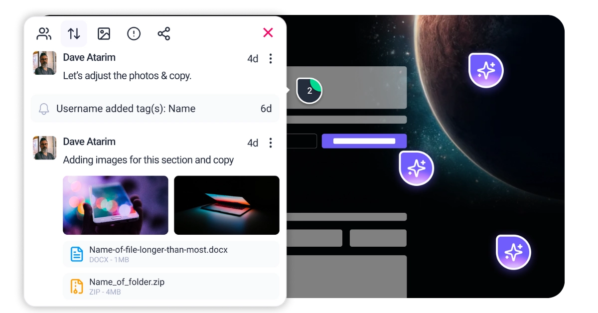
However, fixing accessibility often feels like fighting a hydra where you patch one contrast error only to create a keyboard trap elsewhere. This occurs because accessibility is typically treated as a developer’s cleanup task at the end of a build rather than a team-wide discipline. Atarim solves this structural flaw by bringing your designers, developers, and content creators onto the same visual canvas. With the InnerCircle—your team of specialized AI agents—you can spot contrast issues during the design phase with Pixel, catch navigation flaws before a single line of code is written with Navi, and refine alt text instantly with Lexi. This turns a chaotic, reactive remediation process into a streamlined, proactive workflow.
A Diagnostic Framework for Inclusive Design
You cannot fix what you cannot measure. While automated tools like Lighthouse or WAVE give you a numerical score, they historically only catch about 30% to 40% of actual accessibility barriers. A robust strategy requires you to analyse three distinct layers of your website manually and systematically.
This layer covers how content is presented to the user. It extends beyond simple color blindness to include low vision, screen glare, and cognitive load. You are looking specifically for contrast ratios (minimum 4.5:1 for normal text), text resizing capabilities (does the site break or overlap when zoomed to 200%?), and use of color as a sole indicator.
If an error message is only identified by turning red, a colorblind user will miss it entirely. This is often where design teams struggle the most because “aesthetic” choices frequently clash with readability standards. You must evaluate if the visual hierarchy is clear without relying solely on size or color.
Screen readers do not “see” your site visually; they parse its underlying code structure. Structural analysis focuses entirely on HTML semantics. You need to verify if headings (H1-H6) are nested logically to form a table of contents or if they are chosen arbitrarily for font size.
Check if buttons use actual <button> tags or if they are merely clickable <div> elements that lack keyboard support. Verify that images have alt attributes that strictly describe their function or content. This layer determines whether a non-visual user can navigate your content efficiently or if they are trapped in a maze of unlabelled, chaotic elements.
alt="..." attribute entirely or contain generic, useless filenames like image_001.jpg. alt="" so screen readers ignore it.aria-label="Search Website" directly to the button tag.<button> <span class="sr-only">Search</span> <svg>...</svg> </button>. Ensure the .sr-only class is defined in your CSS to clip the content visually while keeping it in the DOM.<input> has a corresponding <label> linked via the for and id attributes.
<label for="email_field">Email Address</label> <input id="email_field" type="email">.axe-core into your build pipeline. This should be configured to fail the build if it detects syntax errors, missing labels, or invalid HTML. This acts as a gatekeeper for code quality.aria-live="polite" for content that updates without a page reload, such as search results appearing or a cart count updating. This attribute tells the screen reader to announce the change after the current sentence is finished, preventing rude interruptions.aria-expanded="true/false" on mobile menus or accordions and aria-selected="true/false" on tabs.prefers-reduced-motion media query in CSS. Ensure all animations can be paused and avoid any flashing content that could trigger seizures (keeping flashes below 3 times per second).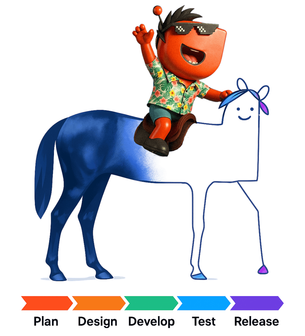


| Cookie | Duration | Description |
|---|---|---|
| __stripe_mid | 1 year | This cookie is set by Stripe payment gateway. This cookie is used to enable payment on the website without storing any patment information on a server. |
| __stripe_sid | 30 minutes | This cookie is set by Stripe payment gateway. This cookie is used to enable payment on the website without storing any patment information on a server. |
| cookielawinfo-checkbox-advertisement | 1 year | The cookie is set by GDPR cookie consent to record the user consent for the cookies in the category "Advertisement". |
| cookielawinfo-checkbox-analytics | 11 months | This cookie is set by GDPR Cookie Consent plugin. The cookie is used to store the user consent for the cookies in the category "Analytics". |
| cookielawinfo-checkbox-functional | 11 months | The cookie is set by GDPR cookie consent to record the user consent for the cookies in the category "Functional". |
| cookielawinfo-checkbox-necessary | 11 months | This cookie is set by GDPR Cookie Consent plugin. The cookies is used to store the user consent for the cookies in the category "Necessary". |
| cookielawinfo-checkbox-others | 11 months | This cookie is set by GDPR Cookie Consent plugin. The cookie is used to store the user consent for the cookies in the category "Other. |
| cookielawinfo-checkbox-performance | 11 months | This cookie is set by GDPR Cookie Consent plugin. The cookie is used to store the user consent for the cookies in the category "Performance". |
| elementor | never | This cookie is used by the website's WordPress theme. It allows the website owner to implement or change the website's content in real-time. |
| PHPSESSID | session | This cookie is native to PHP applications. The cookie is used to store and identify a users' unique session ID for the purpose of managing user session on the website. The cookie is a session cookies and is deleted when all the browser windows are closed. |
| viewed_cookie_policy | 11 months | The cookie is set by the GDPR Cookie Consent plugin and is used to store whether or not user has consented to the use of cookies. It does not store any personal data. |
| wordpress_test_cookie | session | This cookie is used to check if the cookies are enabled on the users' browser. |
| Cookie | Duration | Description |
|---|---|---|
| aka_debug | session | This cookie is set by the provider Vimeo.This cookie is essential for the website to play video functionality. The cookie collects statistical information like how many times the video is displayed and what settings are used for playback. |
| bp_user-registered | 13 years 8 months 8 days | This cookie is used to set which users can access the private pages of the website. It is a functional cookie. |
| bp_user-role | 13 years 8 months 8 days | This is a functional cookie. It is used to set restriction to the user on acessing certain pages like back office, account page etc. |
| bp_ut_session | 13 years 8 months 8 days | This is a functional cookie. This cookie is used to set restriction to the user on acessing certain pages like back office, account page etc. |
| player | 1 year | This cookie is used by Vimeo. This cookie is used to save the user's preferences when playing embedded videos from Vimeo. |
| Cookie | Duration | Description |
|---|---|---|
| _fs | 16 years 4 months 18 days 5 hours 26 minutes | This cookie is provided by Google Tag Manager. This cookie is used for collecting information on user preferences and the behaviour with web campaign content. This is used by website owners for promoting products and events. |
| Cookie | Duration | Description |
|---|---|---|
| _ga | 2 years | This cookie is installed by Google Analytics. The cookie is used to calculate visitor, session, campaign data and keep track of site usage for the site's analytics report. The cookies store information anonymously and assign a randomly generated number to identify unique visitors. |
| _gat_gtag_UA_187048114_1 | 1 minute | This cookie is set by Google and is used to distinguish users. |
| _gid | 1 day | This cookie is installed by Google Analytics. The cookie is used to store information of how visitors use a website and helps in creating an analytics report of how the website is doing. The data collected including the number visitors, the source where they have come from, and the pages visted in an anonymous form. |
| _hjAbsoluteSessionInProgress | 30 minutes | No description available. |
| _hjFirstSeen | 30 minutes | This is set by Hotjar to identify a new user’s first session. It stores a true/false value, indicating whether this was the first time Hotjar saw this user. It is used by Recording filters to identify new user sessions. |
| _hjid | 1 year | This cookie is set by Hotjar. This cookie is set when the customer first lands on a page with the Hotjar script. It is used to persist the random user ID, unique to that site on the browser. This ensures that behavior in subsequent visits to the same site will be attributed to the same user ID. |
| _hjIncludedInPageviewSample | 2 minutes | No description available. |
| CONSENT | 16 years 4 months 18 days 5 hours 24 minutes | These cookies are set via embedded youtube-videos. They register anonymous statistical data on for example how many times the video is displayed and what settings are used for playback.No sensitive data is collected unless you log in to your google account, in that case your choices are linked with your account, for example if you click “like” on a video. |
| vuid | 2 years | This domain of this cookie is owned by Vimeo. This cookie is used by vimeo to collect tracking information. It sets a unique ID to embed videos to the website. |
| Cookie | Duration | Description |
|---|---|---|
| _fbp | 3 months | This cookie is set by Facebook to deliver advertisement when they are on Facebook or a digital platform powered by Facebook advertising after visiting this website. |
| fr | 3 months | The cookie is set by Facebook to show relevant advertisments to the users and measure and improve the advertisements. The cookie also tracks the behavior of the user across the web on sites that have Facebook pixel or Facebook social plugin. |
| IDE | 1 year 24 days | Used by Google DoubleClick and stores information about how the user uses the website and any other advertisement before visiting the website. This is used to present users with ads that are relevant to them according to the user profile. |
| test_cookie | 15 minutes | This cookie is set by doubleclick.net. The purpose of the cookie is to determine if the user's browser supports cookies. |
| VISITOR_INFO1_LIVE | 5 months 27 days | This cookie is set by Youtube. Used to track the information of the embedded YouTube videos on a website. |
| YSC | session | This cookies is set by Youtube and is used to track the views of embedded videos. |
| yt-remote-connected-devices | never | These cookies are set via embedded youtube-videos. |
| yt-remote-device-id | never | These cookies are set via embedded youtube-videos. |
| yt.innertube::nextId | never | These cookies are set via embedded youtube-videos. |
| yt.innertube::requests | never | These cookies are set via embedded youtube-videos. |
| Cookie | Duration | Description |
|---|---|---|
| _bento_session | 7 days | No description |
| bento_events | 17 hours | No description |
| bento_visit_id | 5 hours | No description |
| bento_visitor_id | session | No description |
| GetLocalTimeZone | session | No description |
| gist_id_jquk4gak | 1 year | No description |
| gist_identified_jquk4gak | 1 year | No description |
| gscs | never | No description available. |
| jilt_customer_session_id | never | No description available. |
| jilt_utm | 7 days | No description |
| loglevel | never | No description available. |
| m | 2 years | No description available. |
| sync_active | never | No description available. |
| undefined | never | No description available. |
| wordpress_87c01d6ccf9faf56036dce5d241c08ac | past | No description |
| wordpress_logged_in_87c01d6ccf9faf56036dce5d241c08ac | past | No description |
| wordpress_sec_87c01d6ccf9faf56036dce5d241c08ac | past | No description |
| wordpresspass_87c01d6ccf9faf56036dce5d241c08ac | past | No description |
| wordpressuser_87c01d6ccf9faf56036dce5d241c08ac | past | No description |
| wp-postpass_87c01d6ccf9faf56036dce5d241c08ac | past | No description |
| wp-settings-0 | past | No description |
| wp-settings-time-0 | past | No description |